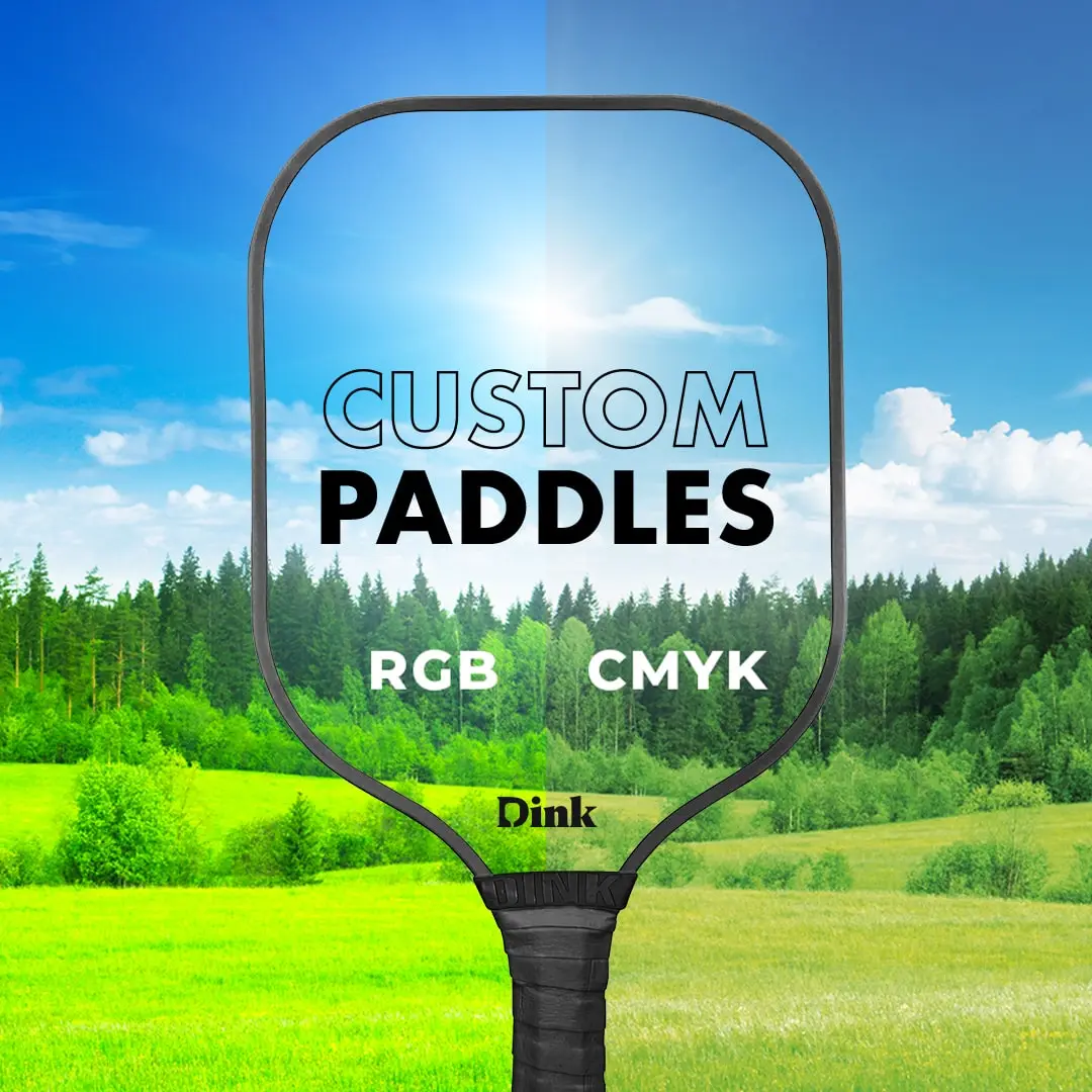
Color Differences When Printing Custom Designs on Pickleball Paddles
Understand the intricacies of color differences in custom pickleball paddle designs to ensure optimal visual appeal and accuracy.
When designing custom pickleball paddles, it's essential to understand the common phenomenon of color differences between on-screen representations and printed outputs. This refers to the discrepancy between how colors appear on a digital screen during the design process and how they appear once printed onto the paddle surface.
We prepared a guide to explain the factors contributing to color variations when printing custom designs on pickleball paddles, helping you to make informed decisions and achieve the desired outcome for your unique creation.
Understanding Color Differences on Custom Pickleball Paddle Designs
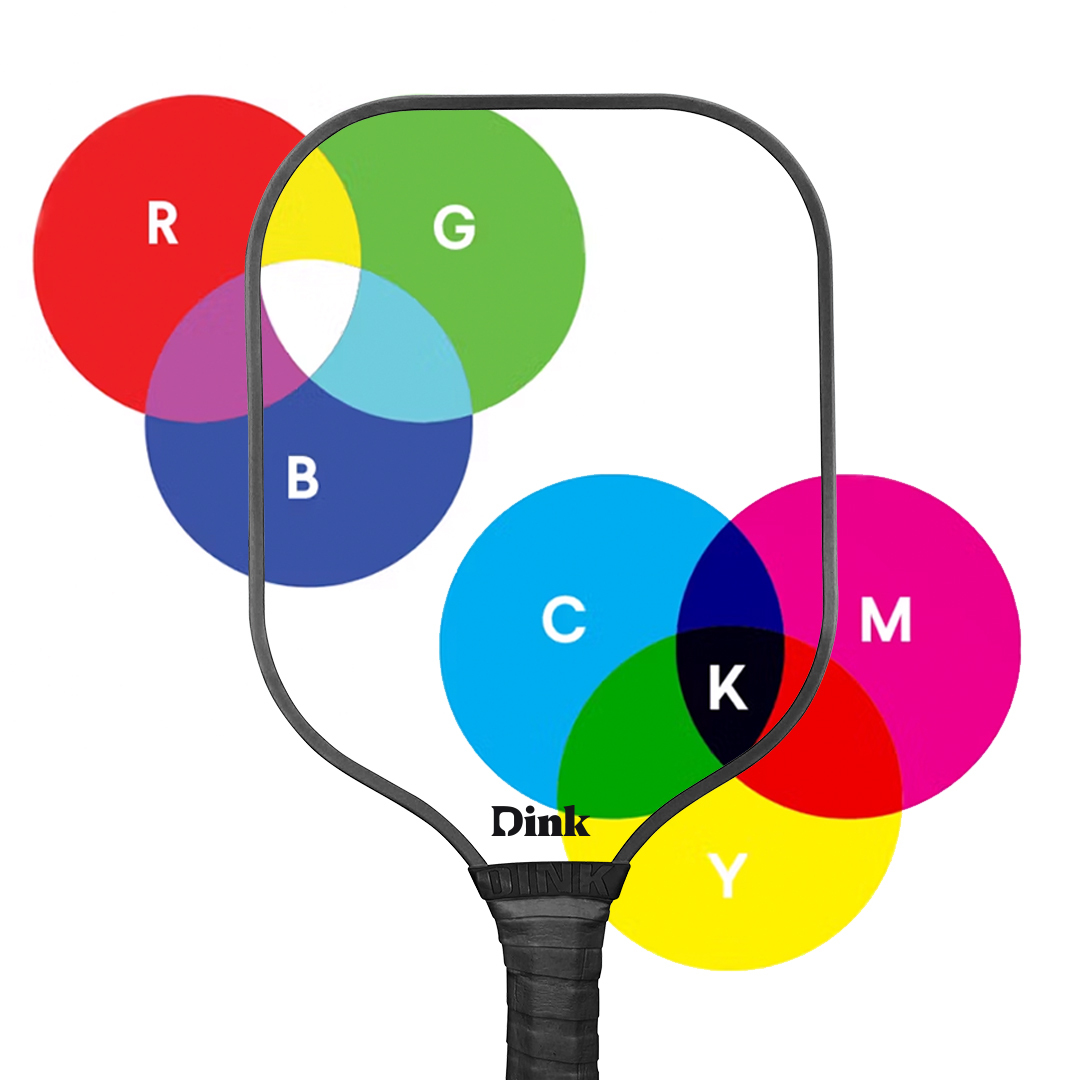
Color differences between on-screen representations and printed outputs are common in design and printing processes. While digital screens use the RGB (Red, Green, Blue) color model to produce a wide range of vibrant colors, printed materials typically rely on the CMYK (Cyan, Magenta, Yellow, Black) color model.
Understanding these differences is crucial as they can result in variations in color accuracy and appearance between what is seen on a screen and what is produced in print.
Understanding Color Models for Screen and Printing
RGB is utilized primarily for digital screens, including computer monitors, televisions, and mobile devices. This model creates colors by blending varying intensities of red, green, and blue light. Combining these three primary colors in different proportions can achieve a wide range of colors, making RGB ideal for displaying vibrant and dynamic visuals on screens.
On the other hand, CMYK is the standard color model used in printing processes, including magazines, posters, and other physical media. In CMYK, colors are created by combining different percentages of cyan, magenta, yellow, and black inks. These colors are applied in layers during the printing process to produce a diverse spectrum of hues.
Unlike RGB, which relies on additive color mixing (combining light to create colors), CMYK utilizes subtractive color mixing (absorbing light to create colors) due to the reflective nature of printed materials.
It's crucial to note that RGB can display a wider gamut of colors compared to CMYK. This means some colors created in the RGB color space may not be accurately reproduced in the CMYK color space.
As a result, there can be variations between the colors seen on a digital screen (RGB) and those produced in print (CMYK). These differences can become particularly noticeable when viewing highly saturated or vivid colors, as CMYK may struggle to accurately replicate the full range of RGB colors.
When designing graphics or images intended for print, it's essential to consider the limitations of the CMYK color model and adjust color settings accordingly to achieve the desired outcome.
Factors Contributing to Color Differences
Color differences between on-screen representations and printed outputs can be influenced by various factors beyond just RGB and CMYK color models.
Firstly, monitor calibration and color profiles play a significant role in accurately displaying colors on-screen. Calibration ensures that the monitor's display settings align with industry standards, while color profiles provide instructions for interpreting color data. Differences in calibration and color profiles across monitors can result in variations in color accuracy between screens and in real-life print.
Variations in color gamut between monitors and printers can impact color accuracy. The color gamut refers to the range of colors a device can display or reproduce. Monitors typically have a wider color gamut than printers, leading to potential discrepancies in color representation. Colors outside the printer's gamut may be adjusted or substituted, affecting the final printed output.
Lighting conditions can significantly influence the perceived color and accuracy to the intended printed output. Different lighting environments, such as natural daylight or artificial fluorescent lighting, can cast varying color temperatures and intensities. This can result in color shifts or discrepancies between on-screen previews and printed materials. For example, a design viewed under warm indoor lighting may appear differently when printed under cooler fluorescent lights.
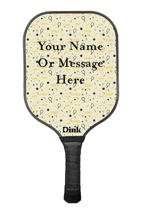
How to Choose Consistent Custom Pickleball Paddle Colors and Designs
Choosing consistent custom paddle colors and designs ensures that your personalized pickleball paddle reflects your preferences accurately and maintains visual cohesion. Here's how to achieve color consistency and harmonious design choices:
Verify design specifications: Before finalizing your design, confirm that it adheres to any color guidelines provided by the pickleball paddle manufacturing company to avoid discrepancies.
Simplify color palettes: Limit your design to a cohesive color palette with minimal hues to reduce the likelihood of color variations during printing.
Coordinate design elements: Ensure that all design elements, such as graphics, text, and background colors, complement each other harmoniously to maintain visual consistency.
Communicate clearly: Clearly communicate your color preferences and expectations to the manufacturer to facilitate accurate color matching and production.
Customize Carbon Fiber Pickleball Paddle
Starting from $179.99
By following these guidelines prepared by Dink’s design team, you can confidently choose consistent custom pickleball paddle colors and designs that align with your vision and preferences.
Meet the Expert
Mike Hardy
Hey, I’m Mike Hardy, founder of Dink. I’ve spent years learning everything there is to know about what makes a paddle play great, and I personally test every single one we make (sometimes until they break) to make sure they’re up to the challenge. So, in my articles, I want to share my knowledge with you to help you find the perfect pickleball equipment for you.